International Institute for Innovation Rebranding
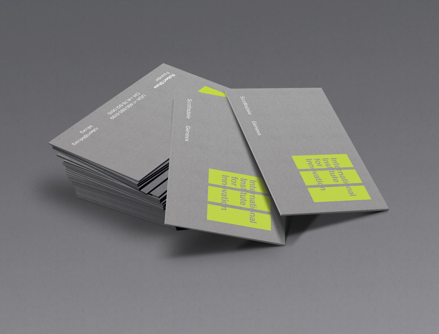
A redesign of a new studio that holds design thinking at the center of it's approach to service. We developed a brand system that asks a little of the audience and communicates filling in the unseen with design. We use gray stocks to offset the bright bold green color we established as the primary brand color. There is also a variation of the mark without type that can be used as an icon on collateral and where needed.